For the right home effect
By Aftab Bandukwala | Vjmedia Works | January 15, 2014
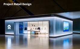
The store has been designed with the Products as the hero
 Build Mart, one of the biggest tiles and bath products retail brands, recently unveiled a multi floored showroom with an area of 21,000 sq.ft. at Yeshwanthpur in Bangalore. Established by Rathod Build Mart Pvt. Ltd., this showroom will have more than 1000 trendy, novel and quality imported tiles for modern houses, bathroom and kitchen settings from across the globe-displayed in excellent combinations.
The showroom has been designed and conceptualised by 4 Dimensions. "The brand objective was to establish the retail outlet as the one-stop destination for tiles and sanitary ware which should not be intimidating but open for all giving value for money. To provide a unique retail experience for customers by combining the outstanding product lines showcasing maximum variety is the main focus of the showroom. Clean and open displays for the customers to easily access and browse through the products with all varieties under one roof was the most important thing which we had to establish through the interior decor of the space,†explains Nagaraja R, Director - Design, 4 Dimensions.
A specific design strategy has been followed in the showroom to showcase the premium products which have been displayed creating exclusive niches. The space has been utilised fully through the use of strong visuals and graphics, clear-cut signage with price and tags to demonstrate the available variety and attract customers in a well demarcated space with enough provision for branding.
 While explaining the design signature of the store Nagaraja R mentions, "Considering the merchandise categories, the colour palette of the store is in hues of grey to enhance the products and also make the store look premium and international. Artistic product displays which are zoned are targeted differently with a neo-contemporary look and feel. The front facade has been kept simple and open having a welcoming look and feel inspired from contemporary residential facades - usage of double height and see through entrance to facilitate foot fall. The store interiors are given a very contemporary and minimalistic look. Forms and shapes have been sparingly used to strike a balance between value and premium. Since a major portion of the interiors is occupied by the products, wall treatments, flooring and ceiling are kept clean and neutral. The entire space is kept more open to showcase the variety of products implementing easy browsing and hassle free shopping. A few accent colours have been added to break the monotony especially near the discussion areas, columns on the rear walls of the store. The guiding factor for the store design process was- "Products are the hero! Since the products are very firm and rigid, the materials used in the store design are kept light and smooth to maintain a balance. Customer comfort and a homely look and feel were the consideration while choosing the material palette. Usage of materials such as wallpaper and textured paint add to the homely ambiance of the store.â€
 The lighting arrangement has been dealt with intricately with LED track lighting which has been used to focus on the product. White coloured light fixtures are fixed to the black painted ceiling to enhance the aesthetic appeal of the overall space while the white light enables the shoppers to see the actual colours of the product. Cove lighting is also used in some places to highlight the key elements in the store.
On the zoning of the store Nagaraja R shares, "The store zoning is self-directing and navigating. It is made user friendly connecting related products together to browse with ease in a layout which is very spacious and open. With proper merchandise display the layout has ample space for mock-ups. Merchandise is displayed in a manner to enhance the visibility of each and every product so that the shoppers can make quick decisions. Each and every product has its unique space allocated to avoid clutter.â€
In terms of graphics and signage a bold communication language has been used with bright colours for the focal areas to attract customers and increase impulse buying. Also, contemporary furniture and styling has been put in to match the design concept. Finally, layering has been employed to provide emphasis on the product range in the entire space.
Advertisement