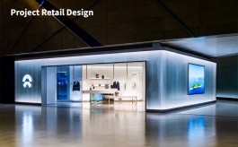
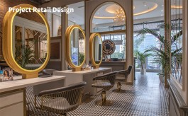
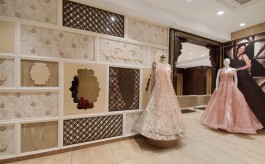
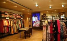
HSJ combines art & luxury in a retail space
By Satarupa Chakraborty | April 27, 2018
Spread across 10,000 sq ft in Lucknow, HSJ has been designed by Delhi-based architecture agency RMDK to exude the legacy of an age-old jewelry brand while incorporating various forms of Indian traditional art and craft.
 Located in the heart of the historic city of Lucknow, Harsahaimal Shiamlal Jewellers (HSJ), is an age-old jewellery brand that exudes grandeur. The Delhi based architectural practice, RMDK, in collaboration with I’m The Centre for Applied Arts, translated their opulent-yet-subtle designs.
 The ground level is demarcated for Gold and the upper level for Diamond and Silver products. A 2.5 m drop in the ground level has been utilised to create a part basement which appears as a stilted ground level at the entrance facilitating parking and entrance lobby.
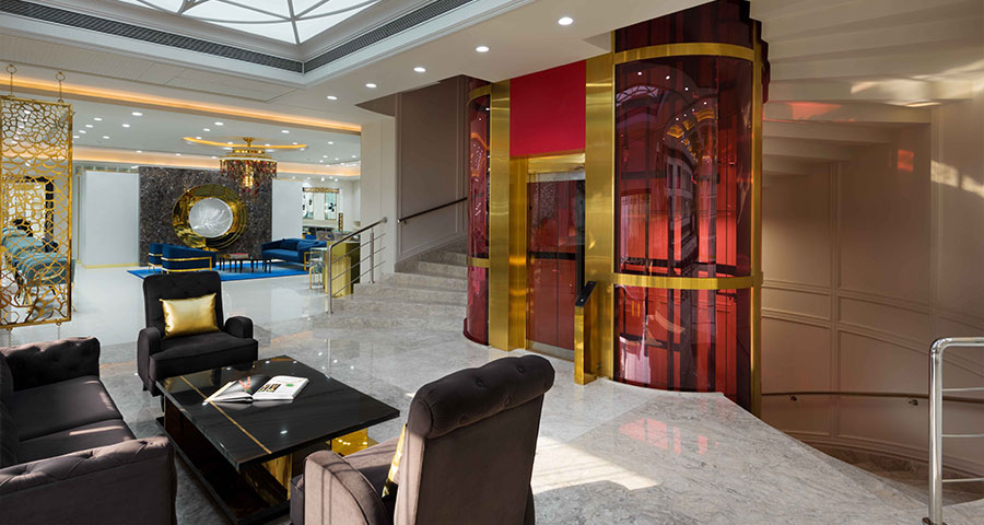 Built as an introverted vault, the solid sandstone façade makes a bold statement with an elegant surface detailing in gold steel. The entrance is marked by a delicately detailed 30 feet high glass door, allowing a glimpse inside generating curiosity. It opens into a reception area with a customised elliptical red glass elevator wrapped by the spiral staircase as an iconic centrepiece. The path to the elevator has been pronounced by colourful floor inlays, inspired by traditional Meenakari craft, replicated on the roof reflecting the brand’s eclectic design style.
The elevator opens into a lobby area on every floor with an illuminated ceiling installation, seen through the main entrance, creating a strong visual element.
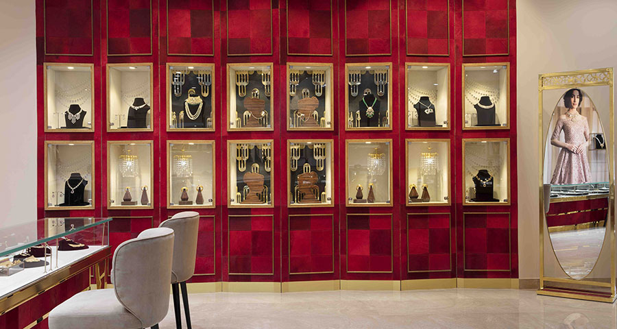
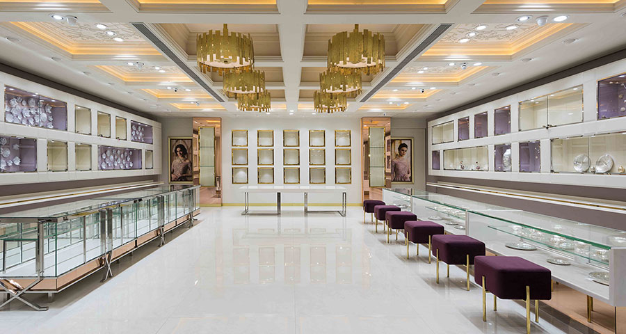
 Every element in this retail space is detailed as a piece of jewellery. Each display section has been designed according to the product range. These individualistic display systems ensure each jewel stands out while getting its own space to celebrate the craftsmanship of the deluxe products. Even the lighting spectrum is customised to enhance the product range in respective zones. Plush furniture and chandeliers have been detailed to look like installations that reflect the essence of the exhibits. The colour palette eloquently binds these elements while niftily complementing and enhancing the displayed products. The tonal variations are softened with neutrals like charcoal and deep brown to create highly articulate spaces.
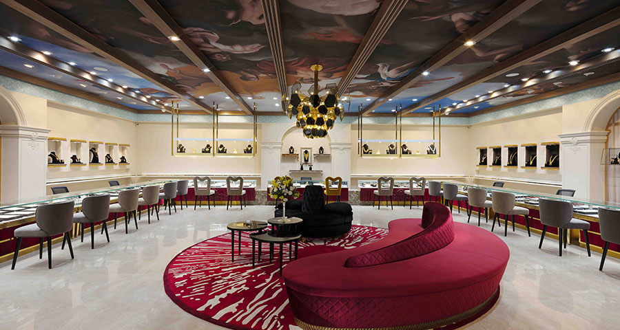
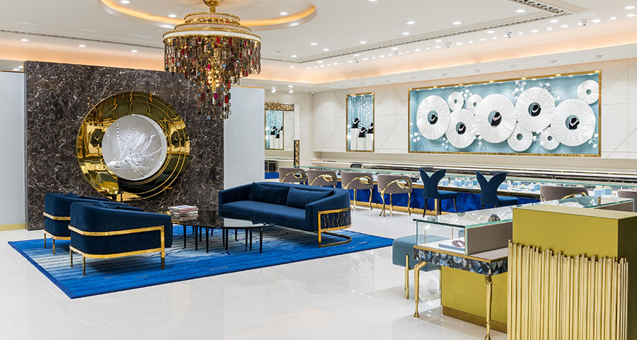
 The Boutique Gold Section sees a predominant use of hues of reds. A 40’ by 40’ hand painted ceiling lends a theatrical touch to an otherwise silent space. Each ornate display frame is designed to look like an antique maestro painting, adding to the opulence of the jewellery. The Daily Wear Gold Section follows a simpler colour scheme of white and gold with the reception feature wall inspired by pearls. The diamond section uses hues of Blue. The semi-precious stone counters along with the bull’s eye arch display and white origami floral displays convert each product into a work of exhibit. The silver section in hues of Purple, is designed in a minimal language to accommodate the mass and chunkiness of silverware while enriching the whole retail experience.
Furniture : I’m the Centre for Applied Arts
Photography : Ankush Maria