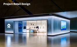
Kurl-on store, Bangalore
By Satarupa Chakraborty | December 26, 2017
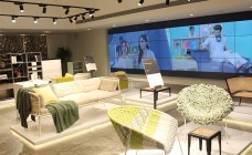
The Kurl-on store, spread across 3200 sq ft at Koramangala, Bangalore and designed by Studio.J, deviates from the look of a typical home furnishing store and wears a look of relaxed and experiential space
 Piloting the experiential design
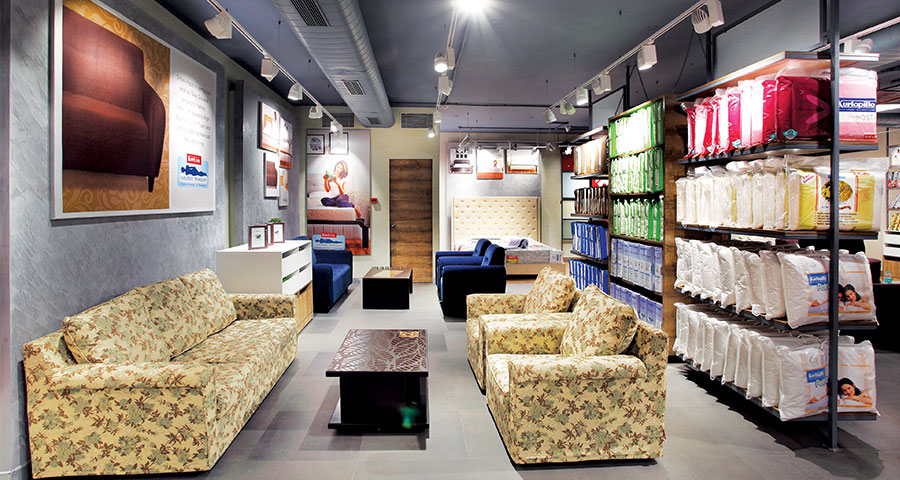
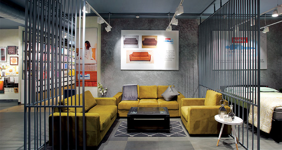
This was Kurl-on first tryst with experiential design which was piloted in Bangalore to be taken to rest of the country. The target was to deviate from the conventional look and feel of a home furnishing store, and give the space a relaxing café like ambience. The idea was to recreate spaces of a house with the products, to portray the feel of the actual look of the product in actual homes. As the brand pbrand deals in mattresses, various mock-ups of bed rooms were created, with side tables used for product description.
 Going grunge
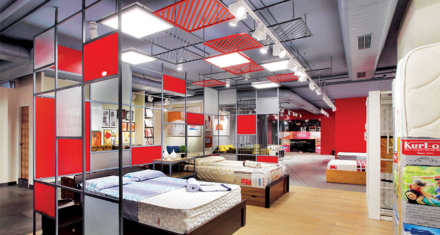
To create a premium setting for a brand that deals in mattresses, pillows, bedsheets etc., the space called for the right mix of display units and mock-ups.
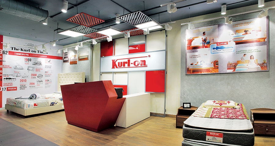
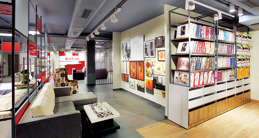
Striving to achieve a look of elegance, the metal grid elements, designed in the brand colours, are used to demarcate specific areas for the various mock ups. The raw grungy feel added to this via the combined use of metal grids, fixtures and a subtle colour palette, accented by the brand’s iconic imagery. The interestingly-shaped cash counter with the visual timeline portraying the brand’s success story, is another innovative addition. Metal grids hanging from the ceiling, have 2’x2’ LED light fixtures, become the focal part of the design character.
 Colour pops
The otherwise subtle setting of the store is challenged by the vibrant red colour used tastefully to create an ever-lasting visual impression. The red and white combination portraying the brand identity for Kurl-on that the design has successfully amalgamated into its interiors. Large product visuals at various touch points with focused lights make for great space of visual promotion etc.
To bring out the best in the merchandise, moveable track lights enhance the focus on the displayed products. The lighting solution added a whole new experience to the space, creating a relaxed mood in the store. The colour palette was chosen keeping the brand identity in mind while the flooring is a combination of grey concrete with wood acting as highlight. The marble finish in the walls further added to the cool, sheen look.
 Displaying it smartly
The store has a very interesting display unit for the display of mattresses. This fixture, with a capacity to display 6 products, is designed in a way that each mattress can be pulled out at any given point. The fixture can also be rotated to display the mattress horizontally like a bed for the customer’s inspection. 8’ height of display units for the top of bed products, make the browing easier for consumers. Ceiling and exposed services have been kept dark in colour to restrict the visual connection up till the eye level.
 T Sudhakar Pai, Chairman and Managing Director, Kurl-on
In-store communication plays a big role when it comes to Indian market. Mattress and comfort products are still not considered as a basic necessity. Though we have gone digital and online, we still felt the need to have an experience center for real touch-and-feel and where visual customer engagement was one of the key factors.
Jenny Andrews, Chief Creative Lead, Studio.J
The store layout is planned to facilitate a consultative engagement, distinctly differentiated from a transactional one, with the customers - both visually and in person. The attention to details and the innovative fixtures used for the display spell a high-quality premium setting which echoes the brand’s philosophy of superior product offerings.
Design : Studio.J
Lighting : gardler Lighting
Main Contractor and Fixtures: Shellworkz
Flooring: Kajaria Tiles
Paints: Asian Paints