Purple Indulgence
By Elke Moebius | Vjmedia Works | April 14, 2014
Harpf-a drink shop, dwells in a listed Gothic style building in the heart of Bruneck, Italy. A testimony to the Harpf legacy, this drink shop in the signature colour purple is a reflection of the values held by the family run business through 100 years. With two distinct product offerings, high quality food products and a range of local and international wines, beers and spirits; the space is a harmonious blend of two different design quotients.
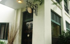
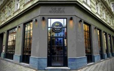
 A cobbled street approach, tall planters and a welcome note of classic white furniture; all of it is juxtaposed with a Gothic facade and the composition draws parallels to a cute corner shop. The awning on top emphasizes the European context. The building being a listed one, little changes have been done to it to present it in a newer flair. Gothic arches greet the customer into the store. The company colour and logo have been incorporated in the central larger arch and their articulation makes way for people to enter. At night the LED illumination, lights up the facade in purple. It matches with the name board below and gets added points for drawing attention.
  The store has two distinct divisions- food and drinks! Your first step into the store and you're exposed to a vintage wonderland. This is the food section of the store which stocks products ranging from homemade pasta, sauces, cheeses and aged cold cuts up to spices, sweets and teas and infusions. This section is visible from the outside and speaks in a consistent language . The white walls and arches create the movement maze. The language of the space complements the architecture of the place and recalls country stores from a different era. The display systems are not a continuous array of lines but rather set up in different formats to suit the variety of products. Shelves of different types and positioned at different heights form the display collage with drawers at the bottom and at random positons as well. The display system is en-massed from wood and handmade pottery and painted in white and purple which adds the identity factor to the store, being in the Harpf's signature colour. The first half of the store story culminates in the sparkle of champagne bottles in a recessed area rightly named'Glory-Box', before moving on to the the passage to the second half of the store.
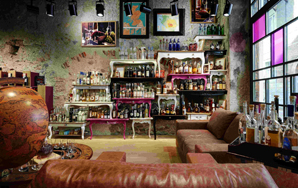
 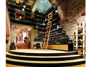 Walking into the rear of the store, one encounters a new attire adorned by the shop. A run-down grunge space plays host to a selection of local and international wines, beers and spirits. The scraped off brick walls, stone Gothic arches, ceiling with wooden beams and the volume containing it all, makes a clear statement of Rough Luxe design style. Two bold design statements under one roof are held together by the thread of the company's colour, purple, furniture accent and the texture of the natural wood. The display articulation and material combination along with the Rough Luxe architecture style draws a character sketch of the space. Creativity also manifests itself in the display innovations. A balance is created in the use of wall heights for merchandise display. Rough dark lacquered metal is used for special beer displays. Bottles displayed on wheels and in wooden boxes around the columns follow the rustic feel of the space. The lighting in the store has two tasks; to enlighten the product and to protect it from light sources which would compromise the quality The lounge set up on a wooden podium is meant to try out new products and enhance knowledge. This idea plays with the human mind through direct contact with the sense of taste. It leads them to an experience at a different level of engagement and manipulates the purchasing decision by bringing out the peculiarities of the product. Also, the design of the lounge is so inviting that it compels the customer to try out the feature even against his own wish. Comfortable leather sofas, homely accessories propped around, products displayed informally on classic furniture artfully stacked set the story board for this space. This space is set against a backdrop of full height glass doors sporting patterns inspired from the Piet Mondrian style of art. Shades of the signature purple colour create the balance of transparency with the outside.
 With two distinct experiences being staged in the store, it needs to be high on the interactive factor. For a smooth transition between the two sections, the connecting gesture is a'Harpf-and-Friends-corner' which is a knowledge zone with a library. It elaborates on the history of the company through photos as well. All these elements merge and create a positioning for the company. The design attributes justify the image of the store and also provide the backing for its identity.
Advertisement