Tresmode: Smart crafting of luxury
By Retail4Growth Team | August 19, 2020
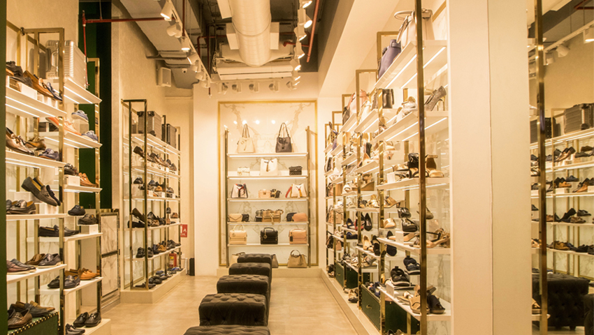
Located in Mumbai, Tresmode’s new store designed by Kaleido architecture, is all about strategic management of space to convey luxury and grandeur.
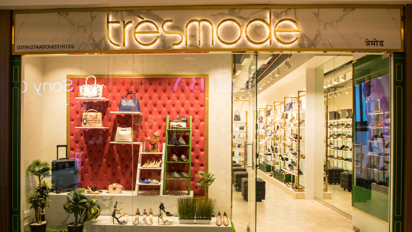
A multidisciplinary design firm, Kaleido architecture’s newly designed Tresmode, the luxury shoe store in Mumbai, seeks to highlight the brand’s global positioning to a well-travelled and cosmopolitan customer base.
The principal architect of the store, Shivangi Narke, believes that a good retail store design is about achieving equilibrium between the product, service and design. The design firm thus endeavoured to recognize the brand identity and understand and avoid the typical loopholes that come up in the visual displays before refurbishing the space for Tresmode.
As Shivangi stated, “The store is festooned with merchandising placed at a certain distance to grab the immediate attention of consumers. Essentially minimalist display to captivate potential attention and uncomplicated maintenance was the real deal.”
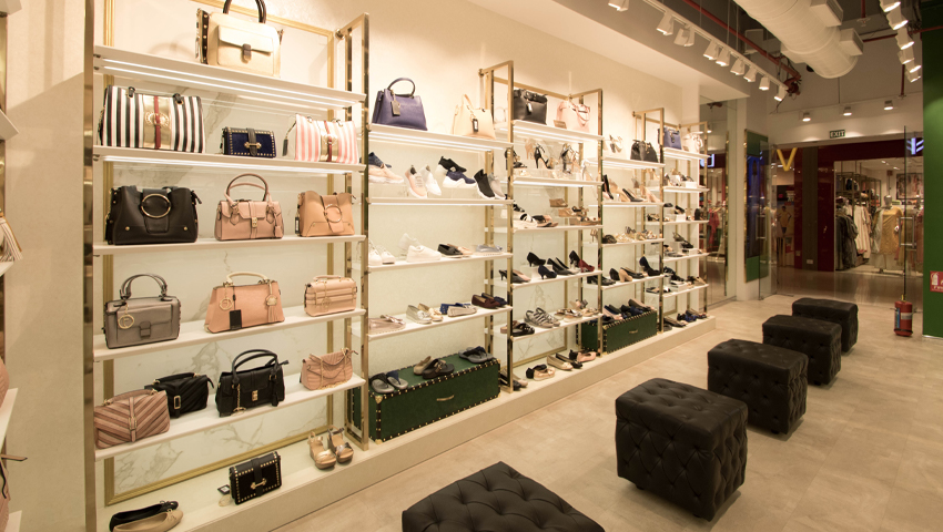
On talking about the choice of colours, lights and interior decorations, Narke added that a subtle colour scheme with a dash of bold colours was the theme for the entire store. The usage of statruario look-a-like tiles along with the gold duco painted mouldings on walls behind the retail displays elevated the whole feel of the space. The profile lights on retail displays, gallery-style track lights used for accent lighting and the backlit gold logo on the façade reiterated the luxury factor and lent the extravagant feel. Also, fixtures such as metal hollow tubes with golden plating and Corian cladded shelves added in the display area took the effect a notch higher.
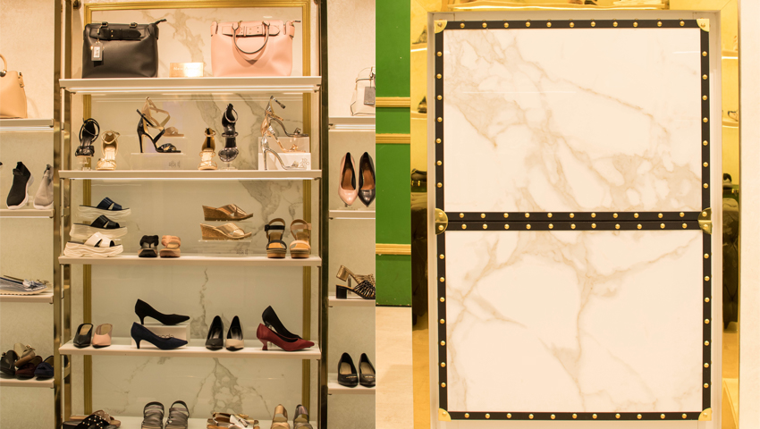
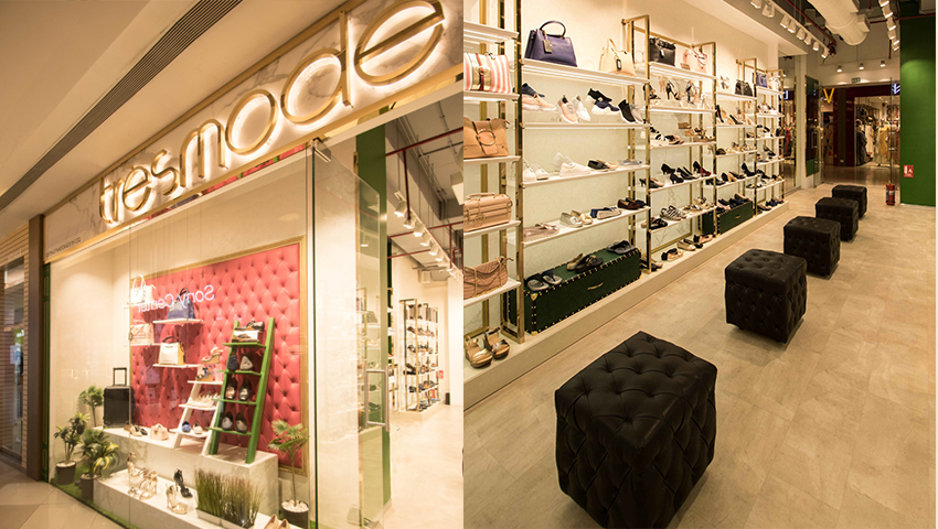
Curating inspiration from classic designs, retail display was ornamented with leather covering, black leather binding on all edges, brass fasteners and brass handles. The floor is covered with rugged beige texture to juxtapose the sleek wall displays.
The dearth of sufficient space was one of the biggest challenges the design firm faced during the renovation. The preparatory store room engaged 35% of the space, making the store space look narrower while also blocking the storefront.
Effective utilization of the storeroom as the background for a storefront display with embellishments of bright pink leather tufted panelling helped in lifting the profile of the space. Also, high ceilings designed in contrast to the narrow, rectangular floor plate subdued the effect of space crunch, making way for shoe trails and easy movement of customers.
Overall, the design team seems to have worked around the space barriers and delivered the desired results by closely understanding client requirements and expectations, while and taking into account the site parameters and potential, before implementing the designs.