Sealy Gallery: Evoking comfort with minimalist elegance
By N Jayalakshmi | February 05, 2024
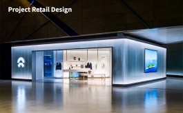
Twenty North Studio, in collaboration with Abraxas Design and Abraxas Interiors,recently designed the mattress store Sealy Gallery at Mega Mall in Gurgaon. The store is all about bringing alive the brand attributes in a minimalist, contemporary space. Rishu Anand, Creative Director at Twenty North Studio, shares details of the store design process with Retail4Growth.
“When it comes to creating a memorable shopping experience, the interior design of a retail store plays a crucial role. In the case of a mattress store, it becomes even more important to strike a balance between aesthetic appeal and functionality. The design should not only reflect the brand's philosophy, but also provide a comfortable and inviting atmosphere for customers to explore and try out different mattresses,” shares, Rishu Anand, Creative Director at Twenty North Studio which, in collaboration with Abraxas Design and Abraxas Interiors, recently designed the Sealy Gallery store at Mega Mall in Gurgaon.
True to the words, Sealy Gallery is a spatial reflection of what the product (mattress) stands for – comfort.
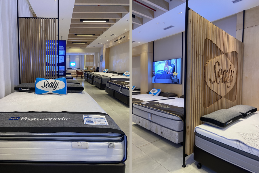
“One of the key aspects of designing this mattress store is the use of natural, intertwining, and flowing materials and colours. The elements not only create a visually appealing environment, but also align with the brand's philosophy. Neutral colours like grey, oak wood, black, and beige are used to enhance the overall value of the space. These colors create a sense of tranquility, making customers feel at ease as they explore the store,” Rishu adds, explaining the design approach and the choice of colours.
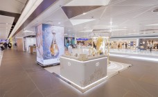
He also informs that the flooring of the store was planned across two levels in order to add dimension and elegance. An elevated level towards the end of the store showcases most luxurious mattresses. This separation not only helps in product range segregation but also creates visual impact. Large-sized tiles with brass inserts across rest of the store further add a touch of sophistication.
Addressing the challenge of layout
One of the key challenges for the design team was designing the layout of the store, especially since they had to work with a typical rectangular space. The team addressed this through careful planning. “The goal was to create a show window feel that immediately captures the attention of passersby. One effective technique is to align a bed towards the window, which is then segregated by a partition in fluidic cutout in woods that forms the logo of the company. This not only highlights the brand, but also creates an intriguing visual element,” explains Rishu.
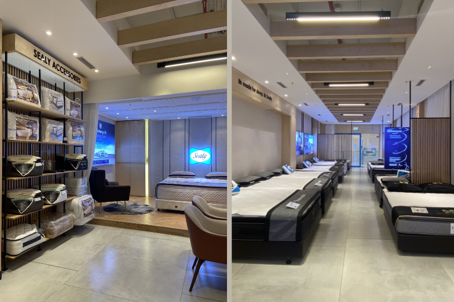
A strategic approach was also followed for the layout of mattress display so as to offer easy segregation and browsing. The left side showcases the budget/domestic range, while the right side is reserved for the premium range. An accessories rack and a discussion table further inside provide customers with additional options and a space for personalized assistance.
Lighting
Quite expectedly, lighting played a very important role in enhancing the store experience. As Rishu shares, “Right lighting can create an inviting and relaxing ambience, enhancing the overall shopping experience. In this mattress showroom, we had dimming controls that allowed client to adjust the intensity of the lighting while trying out different products. This also helped them create a personalized atmosphere that mimics bedroom setting.”
“Retail lighting involves a careful arrangement of contrast, colour and control of different light sources, while also considering energy strategies. In this store, the central walking area is well-lit with higher lux levels compared to the walls which feature the head part of the mattress and where customers lie down. This creates a focal point for customers and ensures they can comfortably evaluate the mattress's features,” Rishu explains further.
Ceiling heights
The utilization of ceiling heights has also been carefully planned in this store to enhance the overall ambience. For example, a lower wooden ceiling height for the luxury section creates a warm and plush feel, while the rest of the store features high ceilings with faux wooden beams, providing a grand and spacious look.
The combination of different ceiling heights served the dual purpose of adding visual delight and defining different areas within the store. The variation in heights also created a sense of depth and dimension, making the space more dynamic.
Graphics and signage
Strategically placed graphics and signages further helped in creating a cohesive brand story in the store. As Rishu says, “Graphics were used to showcase the brand's values, highlight the key features of mattresses, or simply add visual interest to the space.”
Summing up
The Sealy Gallery in effect is characterized by a contemporary design that helped align the store with the brand's values and appeal to the target audience with its combination of clean lines, minimalist furniture and the focus on functionality. As Rishu sums up, “To achieve a contemporary feel, we opted for sleek furniture pieces, minimal clutter, and a neutral colour palette. This created a harmonious and uncluttered environment that allows customers to focus on the mattresses and their individual preferences.”
Team Credits
Design: Twenty North Studio, Abraxas Design, Abraxas Interiors
Photography – Rishu Anand
Flooring – Kajaria tiles, Quickstep wooden floor
Lighting – Ledro lighting
Walls – Ittimi Wall panels, Casa Elements wall texture
General Contractor – Penthouse 21